目次
散布図
トップへ
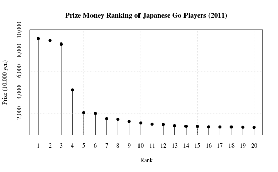
日本棋院囲碁棋士の賞金ランキング(2011): type="h"で棒グラフ
- データ:shokin2011.csv(igodb.jpより作成)
- plot()のtypeを"h"に指定して縦棒で表示する。視覚効果は棒グラフと同じ。
- 後からpoints()で点を追加。
- Y軸の最大値を1億円にするために独自に設定。 xaxt="n", yaxt="n"をオプションにつけて、後から axis() で軸を作成する。
- prettyNum()を使って、数値に3桁ごとに","で区切る。
- 井山・山下・張栩の3人に7大タイトルが集中して、トップ3人で総取りの様相。
x <- read.csv("shokin2011.csv", as.is=T)

plot(x$RANK, x$SHOKIN/10000, type="h", xlab="Rank", ylab="prize (10,000 yen)", main="Prize Money Ranking of Japanese Go Players (2011)", family="serif", ylim=c(0, 10000), yaxs="i", yaxt="n", xaxt="n")
lab <- seq(2, 10, by=2)*1000
axis(side=2, at=lab, labels=prettyNum(lab, big.mark=","), family="serif", lty=0)
axis(side=1, at=x$RANK, x$RANK, family="serif", lty=0)
grid()
points(x$RANK, x$SHOKIN/10000, pch=19)
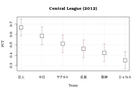
日本プロ野球リーグの勝率(2012): エラーバーを描く
- arrows() を利用して、信頼区間を表示する(参考:monkey's uncle)。
- 2つのグラフのスケールを揃え、かつエラーバーが領域をはみ出さないようにするため、勝率・上限・下限をすべて含んだ仮データでplot()を使うことで枠を作り、その上にpoints()とarrows()でマーカーを描画する。
- arrows()の後で points()を使うことで、エラーバーをマーカーの裏に。
- データ:npb2012.csv(baseball.yahoo.co.jpより)
- plot(), その他の関数はformula (y ~ x) の形式で指定することが出来る。
- パ・リーグは団子。1位の日ハムが最下位オリックスよりも勝率が良いとすら統計的に言えるかどうか。今年の巨人はこんなに強かったのか。
|

|
x <- read.csv("npb2012.csv", as.is=T)
x$N <- x$W + x$L
q <- qnorm(.975)
se <- (x$PCT*(1-x$PCT)/x$N)^(1/2)
x$ub <- x$PCT + q*se
x$lb <- x$PCT - q*se

# moc data for setting plot area
tmpy <- c(x$PCT, x$ub, x$lb)
tmpx <- c(x$rank, x$rank, x$rank)

# central
plot(tmpy ~ tmpx, type="n", xaxt="n", xlab="Team", ylab="PCT", main="Central League (2012)", family="Bookman")
ss <- (x$league=="C")
axis(side=1, at=x$rank[ss], labels=x$team[ss], lty=0)
grid()
arrows(x$rank[ss], x$ub[ss], x$rank[ss], x$lb[ss], angle=90, length=.05, code=3, col="brown4", lty=2)
points(PCT ~ rank, data=x[ss,], cex=2.5, pch=15, col="white")
points(PCT ~ rank, data=x[ss,], cex=2.25, pch=0)

# pacific
plot(tmpy ~ tmpx, type="n", xaxt="n", xlab="Team", ylab="PCT", main="Pacific League (2012)", family="Bookman")
ss <- (x$league=="P")
axis(side=1, at=x$rank[ss], labels=x$team[ss], lty=0)
grid()
arrows(x$rank[ss], x$ub[ss], x$rank[ss], x$lb[ss], angle=90, length=.05, code=3, col="darkgreen", lty=2)
points(PCT ~ rank, data=x[ss,], cex=2.5, pch=15, col="white")
points(PCT ~ rank, data=x[ss,], cex=2.25, pch=0)
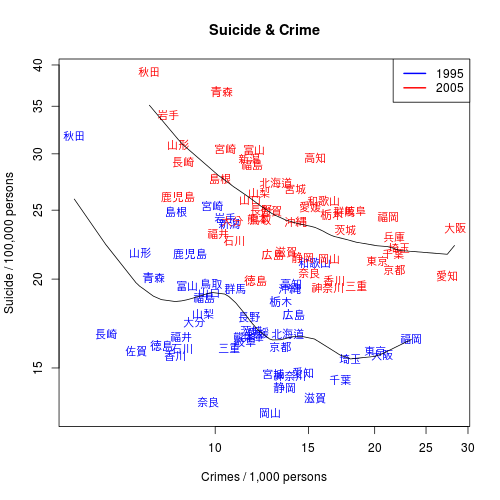
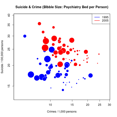
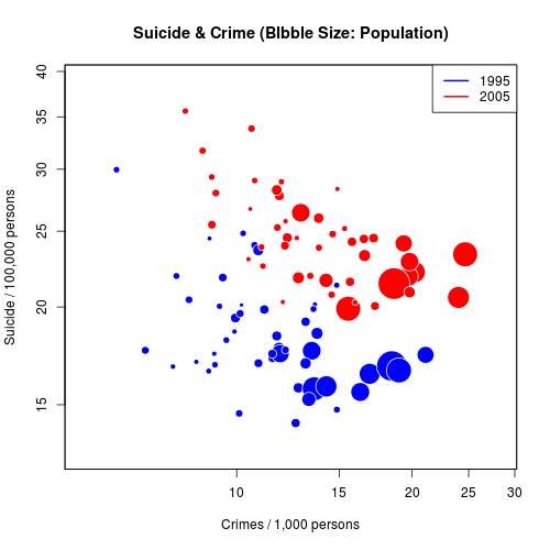
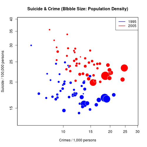
自殺と犯罪: 文字をプロット、Bubble plot
- text()を用いて文字を表示。
- legend()を用いて凡例を配置。
- symbols()を用いてbubble plotを作成(参考:Yau (2011), Visualize This, Ch.6)。
- データ:pref-data.csv
- 日本では、自殺率と犯罪率は負の相関を示す傾向がある。
- 1995年と2005年を比べると、自殺率と犯罪率は同時に上方へシフトしている。
- 人口が大きいところ、また人口密度の高いところでは、犯罪が相対的に多い。
y <- read.csv("pref-data.csv", as.is=T)
y$srate <- y$suicide / y$pop * 10^5
y$crate1 <- y$crime / y$pop * 10^3
y$pop.dens <- y$pop / y$res.area
y$pbrate <- y$psy.bed / y$pop * 10^4
y$aname <- gsub("[県府]", "", y$aname)
y$aname[y$acode==13000] <- "東京"

# text
plot(y$crate1[y$year %in% c(1995, 2005)], y$srate[y$year %in% c(1995, 2005)], type="n", log="xy", xlab="Crimes / 1,000 persons", ylab="Suicide / 100,000 persons", main="Suicide & Crime")
col <- rep(NA, nrow(y))
col[y$year==1995] <- "blue"
col[y$year==2005] <- "red"
ss <- y$year %in% c(1995, 2005)
text(y$crate1[ss], y$srate[ss], labels=y$aname[ss], col=col[ss])
smo1 <- smooth.spline(y$crate1[y$year == 2005], y$srate[y$year == 2005], spar=0.85)
smo2 <- smooth.spline(y$crate1[y$year == 1995], y$srate[y$year == 1995], spar=0.85)
lines(smo1)
lines(smo2)
legend("topright", legend=c(1995, 2005), lwd=2, col=c("blue", "red"))

# pop
plot(y$crate1[y$year %in% c(1995, 2005)], y$srate[y$year %in% c(1995, 2005)], type="n", log="xy", xlab="Crimes / 1,000 persons", ylab="Suicide / 100,000 persons")
col <- rep(NA, nrow(y))
col[y$year==1995] <- "blue"
col[y$year==2005] <- "red"
ss <- y$year %in% c(1995, 2005)
par(new=T)
symbols(log(y$crate1[ss]), log(y$srate[ss]), circle=(y$pop[ss])^(2/3), bg=col[ss], fg="aliceblue", inches=.2, main="Suicide & Crime (Blbble Size: Population)", xaxt="n", yaxt="n", xlab="", ylab="")
legend("topright", legend=c(1995, 2005), lwd=2, col=c("blue", "red"))

# density
plot(y$crate1[y$year %in% c(1995, 2005)], y$srate[y$year %in% c(1995, 2005)], type="n", log="xy", xlab="Crimes / 1,000 persons", ylab="Suicide / 100,000 persons")
col <- rep(NA, nrow(y))
col[y$year==1995] <- "blue"
col[y$year==2005] <- "red"
ss <- y$year %in% c(1995, 2005)
par(new=T)
symbols(log(y$crate1[ss]), log(y$srate[ss]), circle=(y$pop.dens[ss])^(1/2), bg=col[ss], fg="aliceblue", inches=.2, main="Suicide & Crime (Blbble Size: Population Density)", xaxt="n", yaxt="n", xlab="", ylab="")
legend("topright", legend=c(1995, 2005), lwd=2, col=c("blue", "red"))

# bed
plot(y$crate1[y$year %in% c(1995, 2005)], y$srate[y$year %in% c(1995, 2005)], type="n", log="xy", xlab="Crimes / 1,000 persons", ylab="Suicide / 100,000 persons")
col <- rep(NA, nrow(y))
col[y$year==1995] <- "blue"
col[y$year==2005] <- "red"
ss <- y$year %in% c(1995, 2005)
par(new=T)
symbols(log(y$crate1[ss]), log(y$srate[ss]), circle=(y$pbrate[ss])^(1.7), bg=col[ss], fg="aliceblue", inches=.2, main="Suicide & Crime (Blbble Size: Psychiatry Bed per Person)", xaxt="n", yaxt="n", xlab="", ylab="")
legend("topright", legend=c(1995, 2005), lwd=2, col=c("blue", "red"))
その他の散布図
トップへ
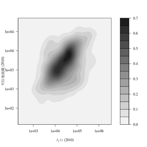
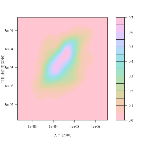
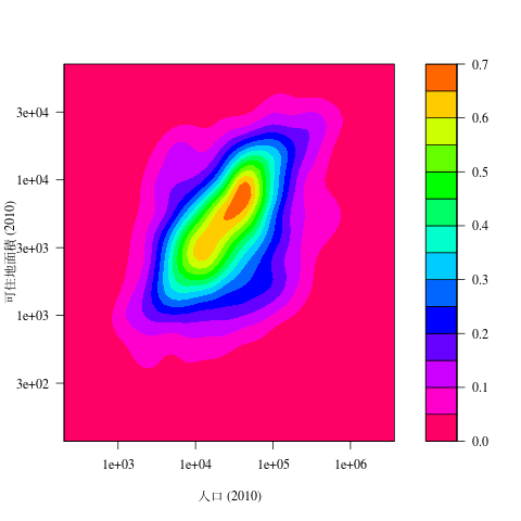
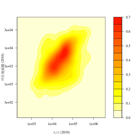
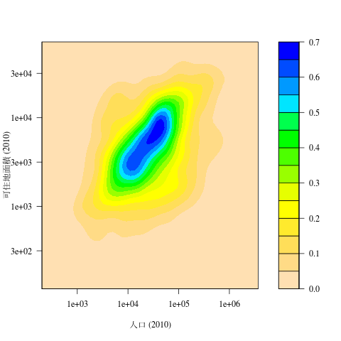
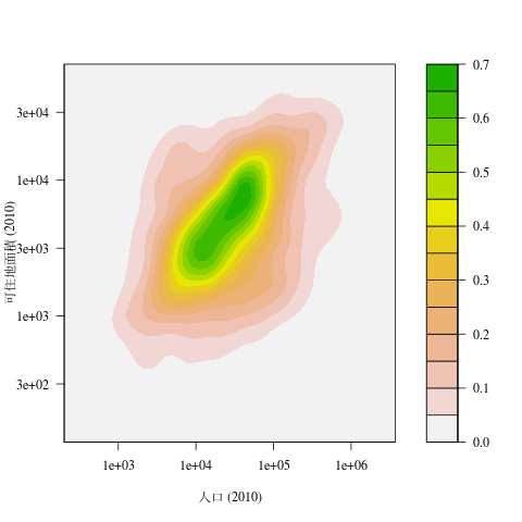
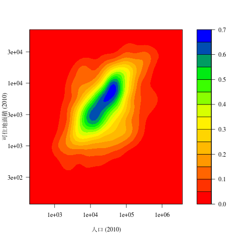
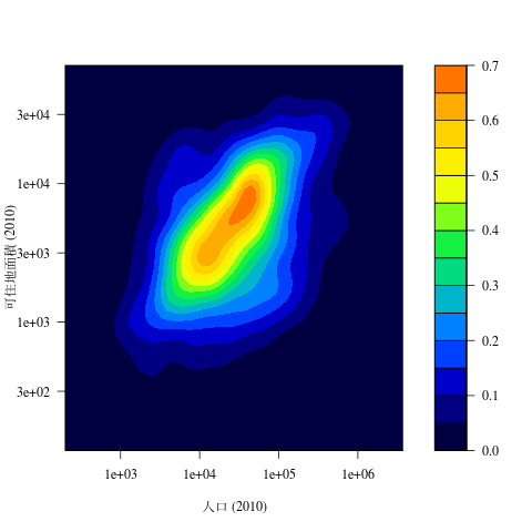
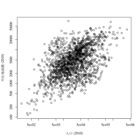
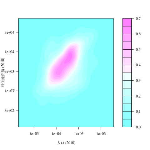
市町村人口と面積: Contour plot
- 色分け等高線プロット
- MASSパッケージのkde2d()で2次元密度を推計して、filled.contour()で描画。
- 対数軸を設定できないので自分で作る。密度をlog10()してから推計し、prettyNum()で数値を変更する。参考URL.
- 色のパターンは、color.paletteを変えるか、colを直接設定するか。
|
|
library(MASS)
library(gplots)
x <- read.csv("city-data.csv", as.is=T)
x <- x[which(!x$seirei.ku),]
x$pop <- x$pop.male.2010 + x$pop.female.2010
x <- x[which(x$pop > 0) & x$res.area.2010,]
png("cont0.png")
plot(x$pop, x$res.area.2010, log="xy", family="serif", xlab="人口 (2010)", ylab="可住地面積 (2010)")
dev.off()

# 密度を常用対数で推計
dens <- kde2d(log10(x$pop), log10(x$res.area.2010), n=50)

# 軸を後で自分で作る用意
lev <- pretty(range(dens$z), 10)
axy <- pretty(range(dens$y))
laby <- format(10^(axy), digits=1)
axx <- pretty(range(dens$x))
labx <- format(10^(axx), digits=1)

png("cont1.png")
par(family="serif")
filled.contour(dens, levels=lev, plot.axes={axis(side=2, at=axy, label=laby); axis(side=1, at=axx, label=labx)}, plot.title=title(xlab="人口 (2010)", ylab="可住地面積 (2010)"))
dev.off()

png("cont2.png")
par(family="serif")
filled.contour(dens, levels=lev, plot.axes={axis(side=2, at=axy, label=laby); axis(side=1, at=axx, label=labx)}, plot.title=title(xlab="人口 (2010)", ylab="可住地面積 (2010)"), col=gray((length(lev):1)/length(lev)))
dev.off()

png("cont3.png")
par(family="serif")
filled.contour(dens, levels=lev, plot.axes={axis(side=2, at=axy, label=laby); axis(side=1, at=axx, label=labx)}, plot.title=title(xlab="人口 (2010)", ylab="可住地面積 (2010)"), col=hcl(seq(0,360,length=length(lev))))
dev.off()

png("cont4.png")
par(family="serif")
filled.contour(dens, levels=lev, plot.axes={axis(side=2, at=axy, label=laby); axis(side=1, at=axx, label=labx)}, plot.title=title(xlab="人口 (2010)", ylab="可住地面積 (2010)"), col=rev(rainbow(length(lev))))
dev.off()

png("cont5.png")
par(family="serif")
filled.contour(dens, levels=lev, plot.axes={axis(side=2, at=axy, label=laby); axis(side=1, at=axx, label=labx)}, plot.title=title(xlab="人口 (2010)", ylab="可住地面積 (2010)"), col=rev(heat.colors(length(lev))))
dev.off()

png("cont6.png")
par(family="serif")
filled.contour(dens, levels=lev, plot.axes={axis(side=2, at=axy, label=laby); axis(side=1, at=axx, label=labx)}, plot.title=title(xlab="人口 (2010)", ylab="可住地面積 (2010)"), col=rev(topo.colors(length(lev))))
dev.off()

png("cont7.png")
par(family="serif")
filled.contour(dens, levels=lev, plot.axes={axis(side=2, at=axy, label=laby); axis(side=1, at=axx, label=labx)}, plot.title=title(xlab="人口 (2010)", ylab="可住地面積 (2010)"), col=rev(terrain.colors(length(lev))))
dev.off()

png("cont8.png")
par(family="serif")
filled.contour(dens, levels=lev, plot.axes={axis(side=2, at=axy, label=laby); axis(side=1, at=axx, label=labx)}, plot.title=title(xlab="人口 (2010)", ylab="可住地面積 (2010)"), color.palette=colorRampPalette(c("red", "orange", "yellow", "green", "blue"), space="rgb"))
dev.off()

png("cont9.png")
par(family="serif")
filled.contour(dens, levels=lev, plot.axes={axis(side=2, at=axy, label=laby); axis(side=1, at=axx, label=labx)}, plot.title=title(xlab="人口 (2010)", ylab="可住地面積 (2010)"), col=rich.colors(length(lev)))
dev.off()
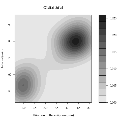
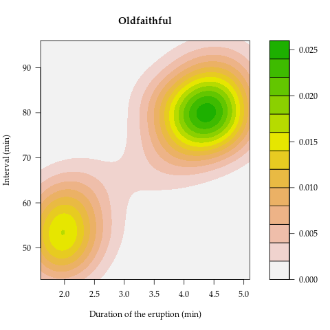
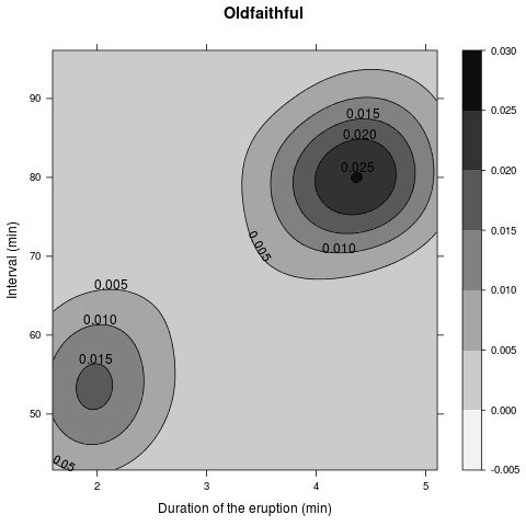
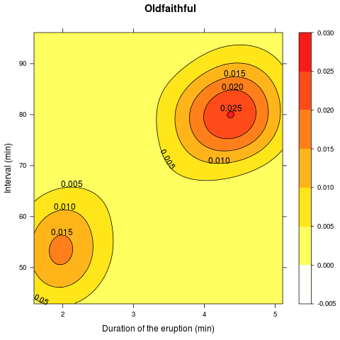
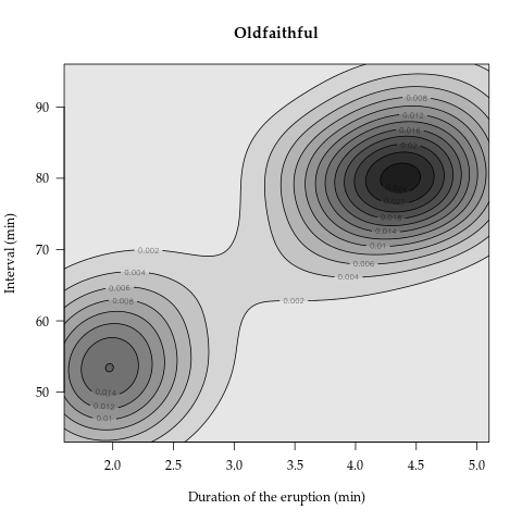
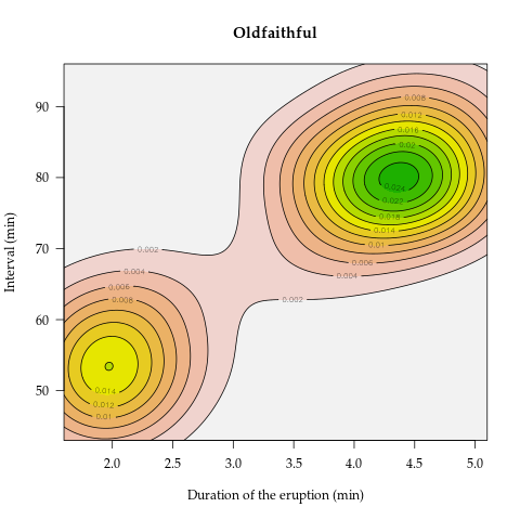
Oldfaithful: Contour plot with 等高線
- 色分け等高線プロットにさらに等高線もつける。
- 方法1:latticeパッケージのcontourplot()を利用。
- 方法2:Ian Taylor によるfilled.contour2()を使って、contourで上書き.
- データはPRMLのウェブサイトから.
- フォントとかの設定方法は分からない。
- 考えてみると、密度なので高さの数字にはあんまり意味はない。
library(lattice)
library(MASS)
x <- read.csv("faithful.txt", as.is=T, sep=" ", header=F)

dens <- kde2d(x$V1, x$V2, n=250)

lev <- pretty(range(dens$z), 12)
png("faithful1.png")
par(family="Palatino")
filled.contour(dens, levels=lev, col=gray(seq(.9,.05,length=length(lev))), main="Oldfaithful", xlab="Duration of the eruption (min)", ylab="Interval (min)")
dev.off()

png("faithful2.png")
par(family="Palatino")
filled.contour(dens, levels=lev, col=rev(terrain.colors(length(lev))), main="Oldfaithful", xlab="Duration of the eruption (min)", ylab="Interval (min)")
dev.off()

# latticeでやるには行列ではだめ?
dat <- expand.grid(x=dens$x, y=dens$y)
dat$z <- as.vector(dens$z)

png("faithful3.png")
par(family="Platino")
contourplot(z~x*y, data=dat, cuts=10, region=T, col.regions=gray(seq(.95,.05,length=100)), main="Oldfaithful", xlab="Duration of the eruption (min)", ylab="Interval (min)")
dev.off()

png("faithful4.png")
par(family="Platino")
contourplot(z~x*y, data=dat, cuts=10, region=T, alpha.regions=.9, col.regions=rev(heat.colors(100)), main="Oldfaithful", xlab="Duration of the eruption (min)", ylab="Interval (min)")
dev.off()

# Ian Taylor's modified function
# see http://wiki.cbr.washington.edu/qerm/index.php/R/Contour_Plots
source("http://tips.futene.net/rsouko/filled.contour2.R")

png("faithful1b.png")
par(family="Palatino")
filled.contour2(dens, levels=lev, col=gray(seq(.9,.05,length=length(lev))), main="Oldfaithful", xlab="Duration of the eruption (min)", ylab="Interval (min)")
contour(dens, add=T, levels=lev)
dev.off()

png("faithful2b.png")
par(family="Palatino")
filled.contour2(dens, levels=lev, col=rev(terrain.colors(length(lev))), main="Oldfaithful", xlab="Duration of the eruption (min)", ylab="Interval (min)")
contour(dens, add=T, levels=lev)
dev.off()
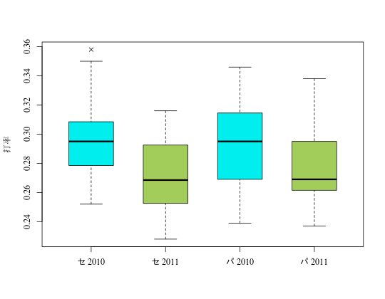
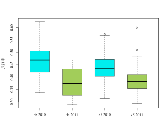
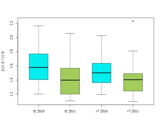
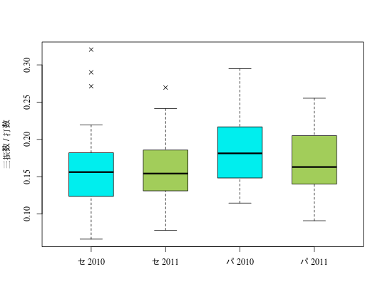
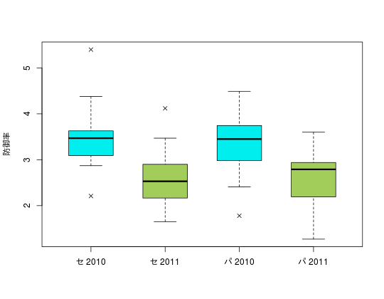
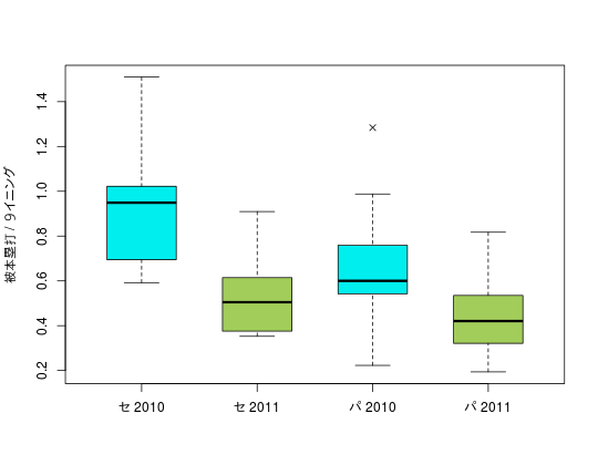
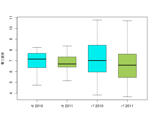
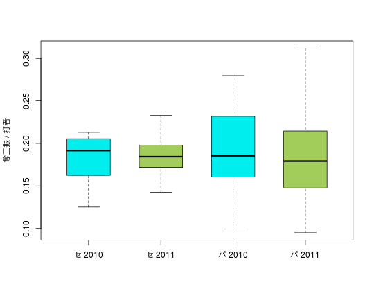
飛ばないボール: Boxplot
- boxplot() の基本。
- boxwex: ボックスの幅。outpch: 外れ値をプロットする時にマーカー。
- boxplot()では family オプションが効かないので、par(family=)でフォントを設定する。
- 打者成績は規定打席数(チーム試合数×3.1)以上の選手、投手成績は規定投球回数(チーム試合数×1)以上の選手を含めた。
- データ: npb2010-2011_b.csv, npb2010-2011_p.csv(プロ野球データFreakより)。
- 2011シーズンからいわゆる「飛ばないボール」が日本プロ野球で使われ始めた。
- 打者成績を見ると、セ・パ両リーグにおいて、2011シーズンに打率、長打率ともに大きく落ち込んでいる。
- 「長打率 / 打率」は、ヒット1つあたりの進塁数になる。安打が全て単打なら1、全てスリーベースなら3になる。この数値も全体的に少し落ちている。ヒットが出なくなったうえ、出ても長打になりにくくなったようだ。
- 一方、三振を奪われる割合はあまり変化していない。ということは、凡打(ゴロやフライ)が増えたということか。
- 投手成績では、防御率と1試合あたりの本塁打数が大きく減っている。
- 奪三振率(1試合あたり三振数)や、打者あたり三振数は変化していない(むしろ微減)。これもやはり凡打の増加を示唆している。
x <- read.csv("npb2010-2011_b.csv", as.is=T)
lab <- ""
lab[x$league %in% "C"] <- "セ"
lab[x$league %in% "P"] <- "パ"
lab <- paste(lab, x$year)
levels <- c("セ 2010", "セ 2011", "パ 2010", "パ 2011")
x$lab <- factor(lab, levels=levels)


par(family="serif")
boxplot(AVG ~ lab, ylab="打率", boxwex=.6, outpch=4, col=c("cyan2", "darkolivegreen3"), data=x)

par(family="serif")
boxplot(SLG ~ lab, ylab="長打率", boxwex=.6, outpch=4, col=c("cyan2", "darkolivegreen3"), data=x)

par(family="serif")
boxplot(SLG/AVG ~ lab, ylab="長打率 / 打率", boxwex=.6, outpch=4, col=c("cyan2", "darkolivegreen3"), data=x)

par(family="serif")
boxplot(K/AB ~ lab, ylab="三振数 / 打数", boxwex=.6, outpch=4, col=c("cyan2", "darkolivegreen3"), data=x)


y <- read.csv("npb2010-2011_p.csv", as.is=T)
lab <- ""
lab[y$league %in% "C"] <- "セ"
lab[y$league %in% "P"] <- "パ"
lab <- paste(lab, y$year)
levels <- c("セ 2010", "セ 2011", "パ 2010", "パ 2011")
lab <- factor(lab, levels=levels)

par(family="serif")
boxplot(ERA ~ lab, ylab="防御率", boxwex=.6, outpch=4, col=c("cyan2", "darkolivegreen3"), data=y)

par(family="serif")
boxplot(HR/IP*9 ~ lab, ylab="被本塁打 / 9イニング", boxwex=.6, outpch=4, col=c("cyan2", "darkolivegreen3"), data=y)

par(family="serif")
boxplot(K/IP*9 ~ lab, ylab="奪三振率", boxwex=.6, outpch=4, col=c("cyan2", "darkolivegreen3"), data=y)

par(family="serif")
boxplot(K/butters ~ lab, ylab="奪三振 / 打者", boxwex=.6, outpch=4, col=c("cyan2", "darkolivegreen3"), data=y)
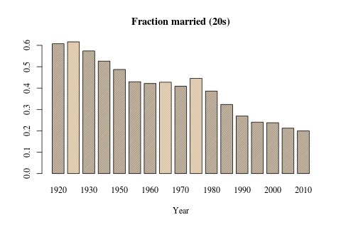
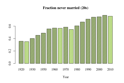
日本の有配偶率・未婚率: Bar plot
z <- read.csv("20s.csv", as.is=T)

# change color if increased
flg <- rep(F, nrow(z))
flg[-1] <- z$never.married.rate[-1] <= z$never.married.rate[-nrow(z)]
col <- rep("darkolivegreen4", nrow(z))
col[flg] <- "darkolivegreen3"

barplot(z$married.rate, names.arg=z$year, border=1, space=.3, xlab="Year", col=col, density=60, main="Fraction married (20s)", family="serif")

# change color if decreased
flg <- rep(F, nrow(z))
flg[-1] <- z$married.rate[-1] >= z$married.rate[-nrow(z)]
col <- rep("burlywood4", nrow(z))
col[flg] <- "burlywood3"

barplot(z$never.married.rate, names.arg=z$year, border=1, space=.3, col=col, density=80, xlab="Year", main="Fraction never married (20s)", family="serif")
ヒストグラム
トップへ
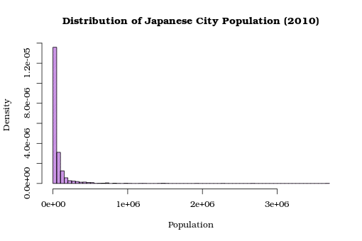
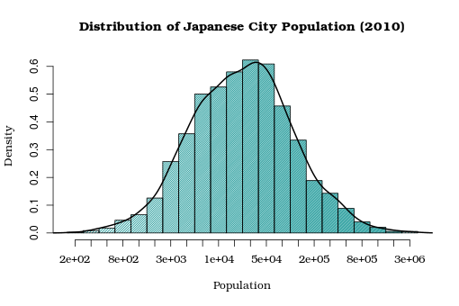
日本の市町村人口の分布
- hist() の基本。
- density をベクトルで指定して,グラデーションをつけている。
- オプションから対数軸にする方法が見つからないので、logを取ってグラフを描き、軸ラベルを独自に作成する方法を取る(参考:R help)。
- データ:city-data.csv(国勢調査. e-statより)
- Log-Normalっぽい? どうでしょう。
y <- read.csv("city-data.csv", as.is=T)

y$pop <- as.numeric(y$pop.male.2010) + as.numeric(y$pop.female.2010)

# linear scale
h <- hist(y$pop[!y$seirei.ku], breaks="Scott", freq=F, col="darkorchid", density=50, border=1, xlab=("population"), main="Distribution of Japanese City Population (2010)", family="Bookman")

# log scale
logp <- log10(y$pop[!y$seirei.ku])
h <- hist(logp, breaks="Scott", freq=F, col="darkcyan", density=seq(30, 80, by=2.5), border=1, xlab="population", main="Distribution of Japanese City Population (2010)", axes=F, family="Bookman")

# trick to make log scale hist
Axis(side=2)
Axis(side=1, at=h$mids, labels=format(10^(h$mids), digits=1), lty=NULL, family="Bookman")

# add density estimate
dens <- density(logp)
lines(dens, lwd=2)
その他いろいろ
トップへ
イチローのヒット数: 画像の上にグラフを描く
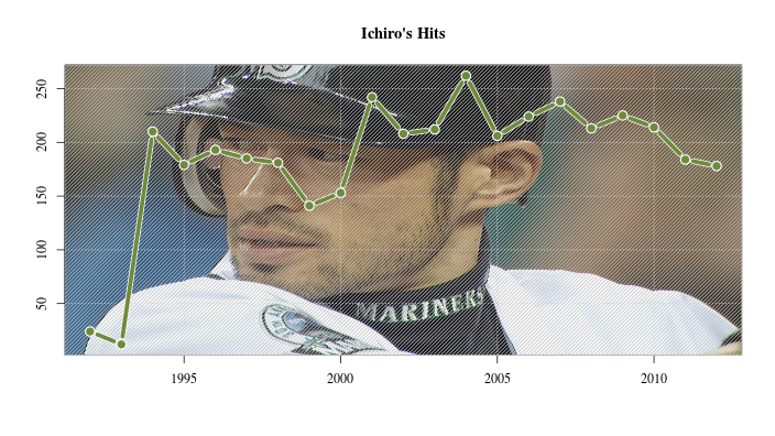
library(png)

h <- read.csv("ichiro-hits.csv", as.is=T)
ima <- readPNG("ichiro.png")

plot(h$year, h$H, type="n", ann=F, xlab="", ylab="", family="Times")

# fill by image
rasterImage(ima, par("usr")[1], par("usr")[3], par("usr")[2], par("usr")[4])

# add grid
grid()

# make it a bit blur
rect(par("usr")[1], par("usr")[3], par("usr")[2], par("usr")[4], col = "gray", density=20)

par(new=T)
plot(h$year, h$H, type="b", lwd=7, pch=20, cex=1.2, col="white", axes=F, xlab="", ylab="")
par(new=T)
plot(h$year, h$H, type="b", lwd=5, pch=20, cex=1, col="darkolivegreen4", axes=F, xlab="", ylab="")
title(main="Ichiro's Hits", family="Times")
マーカーと線の設定
- pch でマーカーを選び、typeでマーカーと線の有無を設定。
- まずtype="n"のplot()で枠だけを作っておいて、後からループを回してpoints()で描画している。
- rect() で背景を塗りつぶしている。
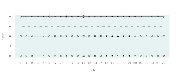
pchs <- 0:25
types <- c("p", "l", "b", "c", "o")

plot(c(min(pchs), max(pchs)), c(1, length(types)), type="n", xlab="pch", ylab="type", axes=F, family="mono")
Axis(side=2, at=1:length(types), labels=types, lty=0, family="mono")
Axis(side=1, at=pchs, labels=pchs, lty=0, family="mono")
rect(par("usr")[1], par("usr")[3], par("usr")[2], par("usr")[4], col="azure2", density=90)
for (j in 1:length(types)) {
    points(pchs, rep(j, length(pchs)), pch=pchs, type=types[j])
}
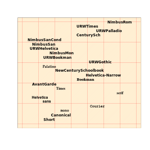
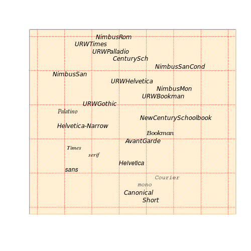
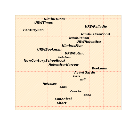
フォント実験
- 様々なフォントの文字を、ランダムな位置に表示(参考:Cookbook for R)。
- 特別のパッケージに拠らないグラフィックなら,大抵 family=... をオプションにつければフォントが変わり、font=... で太字や斜体にする(1: 通常, 2: 太字, 3: 斜体, 4: 太字斜体)。
- 日本語フォントは変化が確認できなかった(環境によるのかも)。
- うまく行っていないフォントも多いが、きっと環境による。
- serifが好み。
- デバイスがpngかpdfかによってエラーの出るフォントが異なる。
font.names.png <- c("Short", "Canonical", "mono", "Courier", "sans", "Helvetica", "serif", "Times", "AvantGarde", "Bookman", "Helvetica-Narrow", "NewCenturySchoolbook", "Palatino", "URWGothic", "URWBookman", "NimbusMon", "URWHelvetica", "NimbusSan", "NimbusSanCond", "CenturySch", "URWPalladio", "URWTimes", "NimbusRom")
pos <- runif(length(font.names.png))
y.rng <- c(0, 1)
x.rng <- c(-.2, 1.2)

fun <- function(face) {
    plot(x.rng, y.rng, type="n", xlab="", ylab="", xaxt="n", yaxt="n", ann=F)
    rect(par("usr")[1], par("usr")[3], par("usr")[2], par("usr")[4], col = "moccasin", density=60)
    grid(col="red")
    for (j in 1:length(font.names.png)) {
        f <- font.names.png[j]
        text(x=pos[j], y=(j / length(pos)), f, family=f, font=face)
    }
}

fun(1)
fun(2)
fun(3)
fun(4)